

‘WAS IT BUTTER YELLOW… OR JUST TOO CLOSE TO WHITE?’
Queen Camilla’s outfit at Peter Phillips and Harriet Sperling’s wedding has unexpectedly become one of the most debated fashion moments of the royal event.
When Queen Camilla arrived alongside King Charles III for the wedding of Peter Phillips and Harriet Sperling, many royal watchers immediately focused on one detail.
The colour of her outfit.
From a distance, Camilla’s elegant ensemble appeared to be an extremely pale shade of butter yellow.
But in certain photographs, especially under bright outdoor lighting, the colour looked remarkably close to white.
And that was enough to spark a debate.
The wedding rule everyone knows
For generations, one of the most widely accepted wedding etiquette rules has been simple:
Don’t wear white to someone else’s wedding.
Because of that tradition, some royal fans quickly questioned whether Camilla’s outfit came too close to bridal territory.
Social media discussions soon filled with comments from followers debating whether the colour choice was appropriate.
Some argued that any shade approaching ivory, cream, or off-white should be avoided entirely.
Others felt the criticism was overblown.
Why some fans defended the look
Supporters of Camilla’s outfit pointed out that the ensemble was clearly yellow rather than white when viewed in person and across multiple photographs.
The soft butter-yellow tone also matched the spring countryside setting and complemented the wedding’s overall pastel colour palette.
Several guests—including Princess Anne—wore similarly light shades.
Many fashion observers felt the outfit projected elegance, warmth, and understated sophistication rather than competing with the bride.
The challenge of pale colours
One reason the discussion became so heated is because pale colours often photograph differently depending on lighting conditions.
Soft yellows, champagne tones, and creams can appear dramatically lighter in certain images.
As a result, what appears yellow in person may seem almost white in photographs shared online.
Royal fashion experts frequently note that this phenomenon creates controversy at weddings far more often than the actual outfit itself.
Harriet remained the center of attention
Despite the debate, few observers seriously suggested that Camilla overshadowed the bride.
Harriet Sperling’s lace wedding gown, veil, and tiara left no doubt about who the star of the occasion was.
Her bridal look was unmistakably different from any guest in attendance.
Even critics of Camilla’s outfit generally acknowledged that there was little chance anyone would confuse the Queen with the bride.
A fashion controversy—or much ado about nothing?
For some royal fans, Camilla’s outfit represented a rare fashion misstep.
For others, it was one of her most polished and flattering appearances in recent memory.
Ultimately, the debate highlights something unique about royal events.
Every colour choice.
Every accessory.
Every hat.
Can instantly become a national conversation.
And while opinions remain divided, one thing is certain:
A simple shade of butter yellow has become one of the most talked-about details from Peter Phillips and Harriet Sperling’s wedding.
Which proves once again that when it comes to royal fashion, even the smallest details never go unnoticed.
News
‘SHE WORE WHITE… AND SUDDENLY EVERYONE HAD AN OPINION.’ Harriet Sperling looked every bit the royal bride at her wedding to Peter Phillips—but one traditional choice has unexpectedly sparked a lively debate among royal fans.
‘SHE WORE WHITE… AND SUDDENLY EVERYONE HAD AN OPINION.’ Harriet Sperling looked every bit the royal bride at her wedding to Peter Phillips—but one traditional choice has unexpectedly sparked a lively debate among royal fans. When Harriet Sperling arrived to…
‘THE YORK SISTERS HAVE MADE THEIR CHOICE.’ Princess Beatrice and Princess Eugenie’s appearance at Peter Phillips’ wedding is fueling fresh speculation about where their loyalties truly lie—and whether they have any interest in following Prince Harry’s path
‘THE YORK SISTERS HAVE MADE THEIR CHOICE.’ Princess Beatrice and Princess Eugenie’s appearance at Peter Phillips’ wedding is fueling fresh speculation about where their loyalties truly lie—and whether they have any interest in following Prince Harry’s path. The wedding of…
“FOUR ARMED TEENAGERS THOUGHT THEY HAD PICKED AN EASY TARGET.” THE HIDDEN DETAIL BEHIND A FAILED CARJACKING IS LEAVING PEOPLE STUNNED
“‘HE HAD A G-UN PRESSED TO HIS HEAD… THEN YEARS OF MARINE TRAINING TOOK OVER.’” A U.S. Marine veteran found himself fighting for his life when four masked teens allegedly attempted a daylight carjacking—only to discover they had picked the…
‘HE HAD A G-UN PRESSED TO HIS HEAD… THEN YEARS OF MARINE TRAINING TOOK OVER.’
“‘HE HAD A G-UN PRESSED TO HIS HEAD… THEN YEARS OF MARINE TRAINING TOOK OVER.’” A U.S. Marine veteran found himself fighting for his life when four masked teens allegedly attempted a daylight carjacking—only to discover they had picked the…
“DIDDY’S LATEST LEGAL NIGHTMARE IS LEAVING PEOPLE STUNNED.” NEW ALLEGATIONS HAVE EMERGED — AND THE DETAILS ARE SPARKING FIERCE DEBATE
Sean “Diddy” Combs is confronting yet another serious legal challenge as an anonymous accuser has filed a civil lawsuit claiming the music mogul ʂҽxυαʅʅყ αssαult him when he was a minor nearly two decades ago. The latest allegations add to…
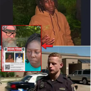
MOTHER BREAKS SILENCE: HEARTBREAKING REVEALATION FROM JA’DERRIUS MINNIEWEATHER’S FAMILY IS LEAVING A COMMUNITY DESPERATE FOR ANSWERS
“A MOTHER’S WORST NIGHTMARE IS STILL UNFOLDING.” This evening, a Baton Rouge family is asking for something no parent should ever have to ask for — help finding their child. 15-year-old Ja’Derrius Minnieweather remains missing, and with each passing hour,…
End of content
No more pages to load